
Decorative Plaster Color Trends for 2026: What's In and What's Out
Ready to Transform Your Walls?
Get samples, pricing, or connect with a certified applicator.
Introduction
The color and texture choices shaping interior design in 2026 reflect broader cultural and aesthetic shifts. As design moves toward authenticity, wellness-focused interiors, and sustainable choices, the plaster colors and finishes gaining prominence tell a story about contemporary values and evolving aesthetic sensibilities.
Understanding 2026 plaster trends helps designers and homeowners make choices aligned with contemporary design languages while ensuring their spaces feel current and intentional. This guide explores colors and finishes trending in 2026, examines the design movements driving these trends, and discusses how individual spaces can engage with trends in authentic ways.
What’s Trending in Plaster Colors and Finishes 2026
The dominant trends emerging in 2026 decorative plaster reflect movement toward warmth, authenticity, and connection to natural materials and processes.
Warm Earth Tones Making a Comeback
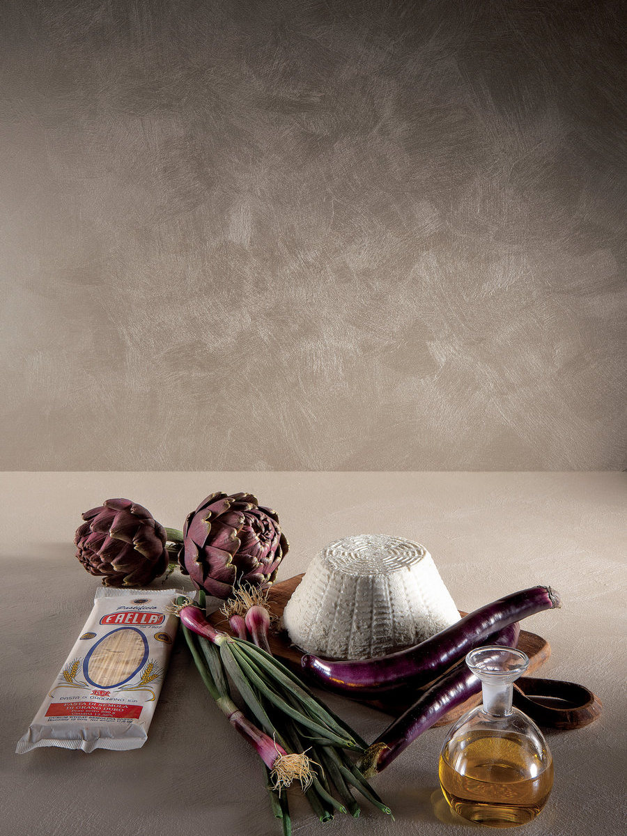
After years of cool gray minimalism, warm earth tones are experiencing genuine renaissance. Colors inspired by natural materials—clay, terracotta, ochre, warm sand, and earthy rust—are gaining prominence as designers and homeowners seek warmth, comfort, and connection to nature.
This shift reflects broader cultural movement toward biophilic design and wellness-focused interiors. The psychological warmth and earthiness of these tones creates spaces that support relaxation and genuine comfort. Warm earth tones connect to authenticity and natural materials in ways that cool colors do not.
Warm earth tones work beautifully in virtually every room type—bedrooms, living spaces, kitchens, dining areas. Unlike bold colors that require careful integration, warm earth tones feel universally appealing and timelessly sophisticated.
Textured, Matte Finishes Over High-Gloss Surfaces
Plaster finishes in 2026 increasingly favor matte, textured surfaces over glossy, highly refined finishes. This shift reflects broader aesthetic movement toward understated sophistication and away from the polished perfection that dominated recent decades.
Matte finishes read as more authentic, more connected to traditional and artisanal processes, and more comfortable. The texture and matte quality suggest handcrafted authenticity rather than industrial perfection.
Glossy, refined finishes—while still appropriate for certain contemporary spaces—are becoming less dominant as matte, textured alternatives gain aesthetic ground.
Organic Imperfection and Visible Movement
Intentional imperfection—visible trowel marks, subtle color variation, surface movement created by hand application—is increasingly valued. Rather than attempting to conceal the hand-applied nature of plaster, trending finishes celebrate it.
This shift represents cultural movement away from demanding perfection toward appreciating authenticity and handcraft. A plaster wall showing subtle evidence of hand application reads as more valuable than a perfectly uniform surface. The imperfection communicates genuine craftsmanship and artistic intention.
Raw Lime and Mineral-Rich Depth
Raw lime finishes—showing the mineral content and natural color of lime without heavy pigmentation—are gaining traction. These finishes celebrate the material’s authenticity and natural beauty rather than covering it with applied color.
Raw lime finishes are particularly popular in contemporary Mediterranean and biophilic interiors where connection to natural materials is prioritized. The subtle color variation and mineral-rich appearance of raw lime creates sophistication without relying on applied pigment.
Specific Colors Gaining Traction in 2026
Within broader trends, specific color families are emerging as particularly relevant to 2026 design.
Terracotta and Warm Clay Tones
Warm terracotta, inspired by clay and earth materials, is among the strongest color trends for 2026. This isn’t bright, high-saturation terracotta but rather muted, sophisticated warm clay tones that feel grounded and organic.
Terracotta plaster in dining rooms, living spaces, and bedrooms creates warmth and comfort. The color supports appetite in kitchens and dining rooms while creating genuinely inviting atmospheres in gathering spaces. Terracotta in bedrooms creates cocoon-like intimacy.
Olive and Muted Sage Green
Soft, muted greens—particularly olive and sage—are experiencing strong renewal as biophilic design gains traction. These colors connect to vegetation and natural landscape while maintaining sophisticated restraint.
Olive green plaster creates grounded, nature-connected interiors. Sage green—slightly cooler and more refined—works beautifully in contemporary and transitional spaces. Both colors support wellness and sense of connection to natural environment.
Mushroom and Warm Taupe
Warm, slightly gray-tinged browns—mushroom, warm taupe, muted greige—are popular as neutral options with personality. These colors provide sophisticated neutrality without the coldness of pure gray.
Mushroom and warm taupe work universally—they complement diverse design styles and coordinate easily with furnishings and accessories. Their popularity reflects desire for grounded neutrals that feel warm and approachable.
Charcoal and Deep Neutral Grays
Deep charcoal and sophisticated neutral grays remain popular, particularly in contemporary and industrial-inspired spaces. However, these colors are increasingly balanced with warm accents and biophilic elements rather than existing as coldly minimalist surfaces.
Charcoal plaster is often paired with warm wood, natural textiles, and warming light to prevent cool, austere atmosphere. The integration of warmth with deep neutrals creates balance.
Dusty Mauve and Warm Dusty Pinks
Warm, desaturated pinks and mauves—sometimes called “quiet luxury” colors—are gaining prominence in sophisticated residential design. These colors occupy the space between neutral and color, providing visual interest without boldness.
Dusty rose and mauve plaster creates unexpected elegance in bedrooms, master baths, and intimate spaces. The color feels contemporary while maintaining timeless quality. What appears as subtle pink in certain light reveals mauve undertones in different conditions.
Sophisticated Navy and Deep Plaster Blues
Deep navy plaster finishes are being reconsidered as designers recognize that the depth of plaster ensures that dark colors don’t create cave-like atmosphere. Navy plaster in accent applications creates drama and sophistication.
Navy plaster appeals to contemporary designers seeking depth and visual drama balanced with the light-responsive qualities that prevent overly dark appearance.
Textures Trending: Surface Movement and Finish Character
Alongside color trends, specific textures and finish qualities are gaining prominence.
Subtle Cloud-Like Movement
Plaster finishes featuring subtle, organic movement—resembling clouds or water—are trending. These finishes celebrate the hand-applied nature of plaster while creating visual interest and sophistication.
Cloud-effect finishes are achieved through specific troweling techniques and require skilled application. They work beautifully in contemporary and wellness-focused interiors.
Chalky, Mineral-Rich Surface Quality
Finishes showing chalky, mineral-rich surface quality—celebrating the natural composition of lime plaster without high polish—are popular. These finishes read as authentic and artisanal.
This approach to finish contrasts with the high-polish, refined finishes that dominated recent decades. The shift reflects broader aesthetic valuation of authenticity and visible handcraft.
Subtle Texture Without Pronounced Pattern
Rather than heavy texture or pronounced pattern, trending finishes feature subtle texture that becomes apparent upon close observation. This approach provides visual and tactile interest while maintaining sophisticated simplicity.
The texture is discovered rather than immediately obvious, rewarding close observation with tactile and visual richness.
What’s Fading: Aesthetic Directions Losing Ground
Understanding what’s declining helps identify which trends are momentary versus sustained.
Stark White Minimalism
The stark white, perfectly smooth, minimally detailed aesthetic that dominated contemporary design is giving way to warmer, more textured alternatives. While white remains appropriate, the sterile, cold minimalism is losing momentum.
This shift reflects recognition that pure minimalism, while conceptually compelling, doesn’t support genuine human comfort and wellness. Warmth, texture, and authenticity create spaces where people actually want to live.
Heavy Texture and Pronounced Pattern
The reverse trend—heavy texture, pronounced patterns, and visually demanding surfaces—is also fading. The pendulum has moved toward balanced texture that provides interest without dominance.
Designer-focused surfaces demanding constant attention are giving way to more restful, subtle finishes that support wellbeing.
Faux Effects and Artificial Mimicry
Faux marble, imitation stone, and artificial-looking finishes attempting to replicate materials they aren’t made of are declining. Authentic materials and authentic finishes are increasingly preferred to imitation effects.
This shift reflects broader cultural movement away from manufactured authenticity toward genuine materials and honest material expression.
The Broader Design Movements Driving 2026 Trends
Understanding the larger aesthetic movements explains why specific colors and finishes are trending.
Quiet Luxury and Understated Sophistication
“Quiet luxury” design—emphasizing quality materials, subtle sophistication, and restrained aesthetics—is dominant in 2026. This approach rejects visible branding and ostentatious display in favor of authenticity and understatement.
Plaster colors in quiet luxury interiors tend toward sophisticated neutrals (mushroom, taupe, warm grays) and muted earth tones (dusty terracotta, muted olive). Finishes celebrate material authenticity rather than applied decoration.
Biophilic Design and Nature Connection
Growing recognition of nature’s role in human wellbeing drives biophilic design trends. Interior spaces increasingly incorporate natural materials, colors inspired by landscape, plants, and natural light.
Plaster in warm earth tones, soft greens, and natural mineral colors supports biophilic objectives. The material itself—derived from natural sources—contributes to nature connection.
Wellness-Focused Interiors
Interior design increasingly prioritizes support for mental and physical health. Color choices, material selections, and environmental design all contribute to wellness-supporting spaces.
Warm, comfortable colors; low-toxicity, natural materials; and spaces supporting relaxation and stress reduction are increasingly specified. Venetian plaster, with its natural composition and non-toxic properties, aligns perfectly with wellness-focused design.
Sustainability and Authentic Craftsmanship
Sustainable design and appreciation for traditional craftsmanship continue gaining importance. Consumers increasingly value authentic handcraft, durability, and environmentally responsible choices.
Venetian plaster—a sustainable, durable material applied using time-honored techniques—aligns with these values. The emphasis on artisanal application and material authenticity resonates with contemporary sustainability consciousness.
Return to Warmth and Comfort
After years of cool minimalism, design is moving toward warmth and comfort. This shift reflects recognition that genuinely beautiful interiors must support human comfort and emotional wellbeing, not just aesthetic ideals.
Warm colors, welcoming textures, and spaces that feel like homes rather than galleries are increasingly valued. This shift creates opportunity for plaster in warm earth tones, supportive colors, and authentic finishes.
Regional Variation in Trends
While global trends exist, regional design traditions influence how trends manifest locally.
Mediterranean and European Influence
Mediterranean design traditions emphasizing authentic earth materials, warm tones, and handcrafted aesthetics are influencing global trends. The renewed appreciation for warm earth tones and textured finishes reflects Mediterranean aesthetic resurgence.
Regional design traditions rooted in authentic materials are experiencing renewed relevance as global design moves toward sustainability and authenticity.
Contemporary American Minimalism’s Evolution
American minimalism is evolving from cold, sterile aesthetic toward warmer, more humanistic minimalism incorporating natural materials and supportive colors. Plaster in warm neutrals and soft earth tones fits this evolution.
How to Engage Authentically with 2026 Trends
Understanding trends doesn’t mean slavishly following them. Authentic engagement with trends means incorporating trending elements that genuinely align with your aesthetic and values.
Evaluate Your Personal Aesthetic
Before committing to trending colors, honestly evaluate your personal aesthetic. Do warm earth tones genuinely resonate with you, or are you choosing them because they’re trending? Do matte, textured finishes align with your vision, or do you prefer refined polish?
Authentic, enduring interiors reflect personal aesthetic and values, not trend-chasing. If trending colors don’t resonate with you, stay true to your vision.
Incorporate Trends Selectively
Rather than redesigning entire spaces around trends, consider incorporating trending elements selectively. Perhaps the trending warm terracotta appears as a single accent wall, while other walls remain in colors more personally significant.
This approach allows you to engage with trends without wholesale aesthetic changes that may feel dated once trends shift.
Consider Longevity
Ask whether trending colors and finishes will feel beautiful and relevant in 5-10 years. Trends like warm earth tones, subtle texture, and natural materials tend toward longevity because they connect to enduring aesthetic principles and human comfort.
Trendy finishes that rely on novelty rather than design fundamentals date more quickly. Choose trends rooted in lasting principles rather than momentary novelty.
Giorgio Graesan Products Featured
Giorgio Graesan’s plaster products naturally align with 2026 trending colors and finishes. Their Italian heritage connects to warm earth tones and authentic material traditions. Their products are manufactured with emphasis on natural materials, sustainable practices, and artisanal craftsmanship.
Recommended Giorgio Graesan products for 2026 color and finish trends:
- Spatula Stuhhi — Polished stucco for glossy, marble-like surfaces in warm earth tones and sophisticated colors. 6 color families.
- Istinto / Segui il Tuo Istinto (1070) — Lime + marble + minerals with endless finish possibilities: Pietra Spaccata, Pietra Levigata, Pietra Vissuta, Pietra Zen, Bamboo, Cemento Naturale, Pietra Contemporanea. Perfect for subtle texture and organic movement trending in 2026.
- Spirito Libero (1060) — Design stucco creating clean, elegant walls in 2 steps. Ideal for refined finishes prioritizing sophistication.
- Marmorino 2020 (1090) — Classical Marmorino Veneziano updated with marble powders. Delivers raw lime and mineral-rich depth.
- Muro Naturale (1075) — Lime + marble + mica in 1 coat, suitable for creating matte, subtle textures.
- Decorative Paints — Gioia (silver mother-of-pearl, 169 colours), Oro (gold mother-of-pearl, 107 colours), Minimal (fine nacreous + quartz, 169 colours), and other collections for color-forward applications.
These products provide the material foundation for interiors engaging authentically with 2026 trends—warm earth tones, textured matte finishes, visible craftsmanship, and sustainable, non-toxic formulations—while maintaining timeless, enduring design.
Conclusion: Trends as Reflection of Evolving Values
2026 plaster color and finish trends reflect broader cultural movement toward warmth, authenticity, wellness, and sustainability. The resurgence of warm earth tones, the celebration of visible handcraft, the shift toward matte and textured surfaces—these aren’t arbitrary fashion shifts but expressions of changing values about how spaces should support human wellbeing and environmental responsibility.
When you choose plaster colors and finishes aligned with 2026 trends, you’re engaging with these evolving values. You’re prioritizing comfort over cold perfection, authenticity over manufactured imitation, and sustainability over disposable design.
Choose colors and finishes that resonate genuinely with you, that align with your spaces and aesthetic vision, and that reflect your values around wellbeing and environmental responsibility. When trend engagement is authentic and personally meaningful, the resulting interiors remain beautiful and relevant beyond the trend cycle.
Explore Giorgio Graesan’s trending product collections through Muro d’Arte to discover how contemporary plaster finishes can create spaces that feel beautiful, authentic, and genuinely supportive of modern living.